Designing a great contact form is a delicate balancing act. You need to gather essential information for your business, but you have to do it without frustrating the user. The best forms are always short, intuitive, and trustworthy, making it effortless for someone to get in touch.
Why Most Contact Forms Fail to Convert
Let's get straight to it: your contact form is probably losing you business. For too long, we've relied on the same old static, multi-field forms that feel more like a pop quiz than a friendly hello. This entire approach is completely out of sync with how people browse and interact with websites today.
The real culprit here is something called cognitive load—basically, the amount of brainpower someone has to use to complete a task. Every single field you add, every confusing instruction, and every moment of hesitation piles on this mental effort. When that effort feels like too much work for the reward of contacting you, people just give up. It’s a silent conversion killer, turning warm leads into another bounced visitor.
The Psychology of Form Abandonment
Why do people bail? The reasons are usually pretty simple. They're busy, they’re worried about how you'll use their data, or they're just annoyed by a clunky design that doesn't work well on their phone. Each field is another hurdle, giving them one more excuse to click away.
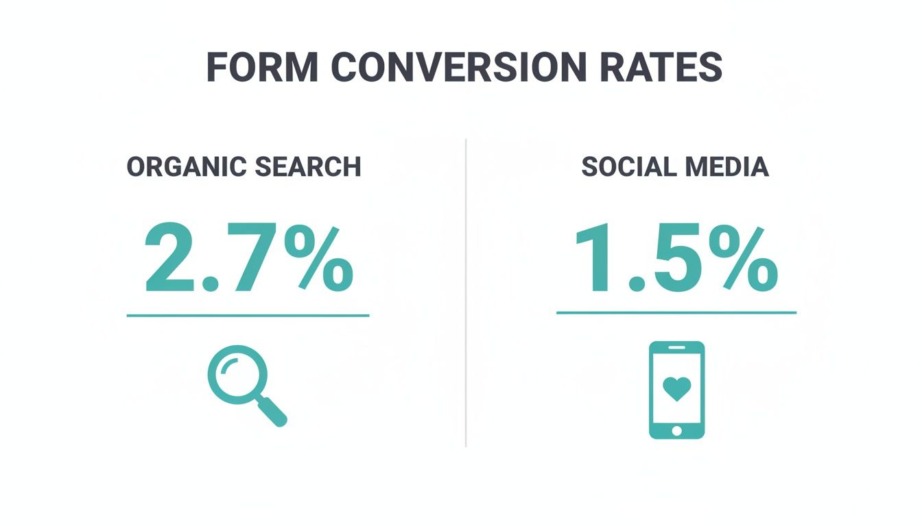
This isn't just a hunch; the numbers tell a pretty grim story. Fresh 2026 data shows that the average form conversion rate across 14 different industries is a painfully low 1.7% to 2.9%. It gets even more specific when you look at where the traffic is coming from.
Take a look at how different traffic channels perform when it comes to form submissions. This table highlights just how big the drop-off can be.
Average Form Conversion Rates By Traffic Source
| Traffic Source | Average Conversion Rate |
|---|---|
| Organic Search | 2.7% |
| Social Media | 1.5% |
| Email Marketing | 2.9% |
| Paid Search | 2.1% |
These figures tell us that even visitors actively looking for a solution are hesitant to fill out a standard form. The gap is especially jarring for social media traffic—for every 100 people you bring in from a social campaign, more than 98 of them will leave without saying a word.
The visual below really drives this point home.
A poorly designed form does more than just miss out on leads; it actively hurts how people see your brand. It sends a clear message: your process is complicated, and you don't really care about the user's experience.
Rethinking your contact form isn't just a small design update; it's a fundamental business decision. The first step is to move away from these tired, old designs and start building a better lead capture form that actually invites conversation instead of shutting it down.
Building the Blueprint for Your Contact Form

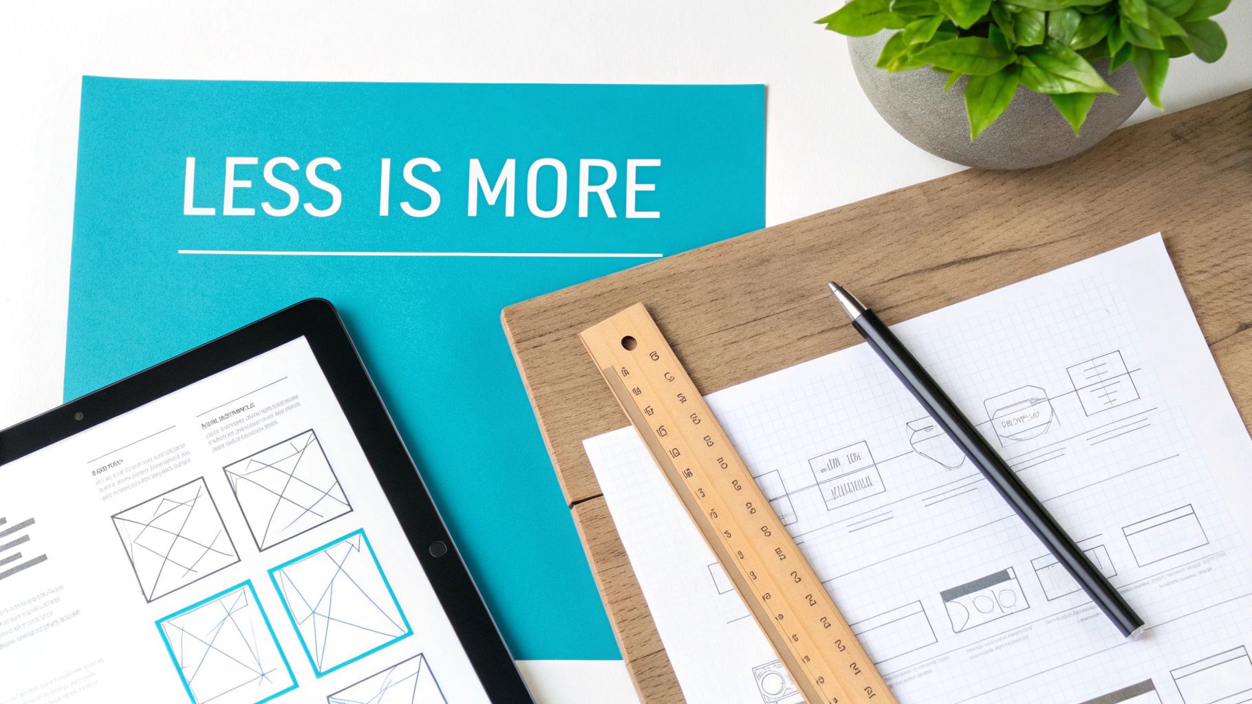
When it comes to designing a contact form that actually works, I always start with one core idea: less is more. Think of every field as a tiny hurdle for your visitor. Your job isn't to collect a lifetime of data right away; it’s simply to start a conversation with the least possible friction.
Before you even think about adding a field, stop and ask yourself this crucial question: "Do I absolutely need this for the very next step?" If the answer is anything but a resounding "yes," cut it. For most businesses, all you really need to get the ball rolling is a name and an email. You can always gather more details later on, after you've made that initial connection.
This minimalist approach isn't just a design preference—it has a massive impact. I've seen countless studies show that each additional form field can bump up your abandonment rate by as much as 10%. That’s why so many old-school forms hemorrhage leads, while modern, conversational forms see their completion rates soar.
Structuring Your Form for a Smooth Experience
Once you’ve boiled your form down to the bare essentials, the next step is to arrange those fields in a way that feels completely natural. The flow should be so intuitive that your user moves from one box to the next without a second thought.
A logical, proven structure usually looks like this:
- Name: It's personal and the easiest place to start.
- Email: This is how you'll get back to them.
- Message (Optional): This gives them the freedom to add context if they want to.
This simple progression mirrors how we introduce ourselves in real life. As you build this out, adding features like real-time form validation can be a game-changer. It gives users instant feedback, cuts down on errors, and keeps the whole process feeling effortless.
Key Takeaway: The goal is to make filling out the form feel like one quick, easy task, not a dozen tiny, annoying ones. A logical field order is how you get there.
Another thing that's absolutely non-negotiable in 2026 is a single-column layout. Multi-column forms are a usability nightmare. They're confusing on a desktop and completely broken on mobile, forcing users to pinch and scroll just to figure out where to go next. A single, vertical column creates a clear, predictable path from top to bottom, making the experience faster and far less frustrating.
Writing a Call-to-Action That Actually Converts
Finally, let's talk about the button. The word "Submit" is lazy, generic, and frankly, a little bossy. It tells the user what they have to do for you, not what they're about to get.
Your call-to-action (CTA) button needs to be specific and highlight the value for the user. Ditch "Submit" and try something that connects with their goal:
- Get Your Free Quote
- Schedule a Demo
- Send My Message
- Start the Conversation
This simple shift in wording completely reframes the action. It becomes a benefit for them, not just a data-entry chore for your CRM. If you're looking for more ideas, it's worth exploring some well-designed contact form templates that nail this principle.
Your Form's Words and Feel Matter More Than You Think
So, you’ve whittled down your form to only the must-have fields. That’s a huge first step, but the real magic is in the details. What separates a form that feels like a breeze from one that feels like a chore is often the tiny bits of text that guide people along the way.
We're talking about microcopy. These little words and phrases have a massive job: they set expectations, build trust, and answer questions before a user even thinks to ask. When done right, microcopy transforms a cold, data-entry task into a genuinely helpful interaction.
Writing Labels and Placeholders That Actually Help
Every single field needs a crystal-clear label. This isn't just a suggestion; it's essential for usability. Place the label directly above the input box so it's always visible, even after someone starts typing. Keep them short and sweet, like "Full Name" or "Work Email."
Now, let's talk about placeholder text—that faint text you see inside an empty form field. Be very careful here. It vanishes the moment someone clicks into the box, which can make them forget what they were supposed to be typing. Never use it as a substitute for a proper label.
Instead, use it to give a helpful example.
- Bad Placeholder: "Enter your email address" (This is just redundant.)
- Good Placeholder: "e.g., [email protected]" (This clarifies the format perfectly.)
It's a small change, but it adds clarity without creating confusion.
Microcopy is the voice of your form. Make sure it sounds helpful, clear, and encouraging. A user who feels confused or anxious will leave. A user who feels confident will click "submit."
Good microcopy doesn't stop at labels. Consider adding "helper text" just below a field to offer more context. Under a "Message" box, for instance, you could write something like, "Let us know how we can help. We typically respond within 24 hours." That simple sentence manages expectations and reassures the user that their message won't go into a black hole.
Designing a User Experience That Feels Effortless
Beyond the words themselves, the overall feel—the user experience (UX)—of your form is critical. Good form UX is all about making the process feel easy, logical, and even pleasant.
A powerful tool for this is visual hierarchy. Use size, color, and spacing to draw the user's eye down the form from one field to the next. A clear path means no one has to wonder where to start, what to do next, or how to finish.
Here are a few design principles I always stick to:
- Give It Room to Breathe: Don't cram everything together. Generous white space around fields and labels makes the form feel less intimidating and much easier to read.
- Use Real-Time Validation: Nobody likes filling out an entire form only to be told they made a mistake at the very end. Inline validation gives immediate feedback—a little green checkmark for a valid email or a subtle red border for an error. This catches issues early and cuts down on frustration.
- Write Encouraging Error Messages: When mistakes happen, the message should be a guide, not a dead end. Instead of a blunt "Invalid Email," try a friendlier, "Please enter a valid email address." That subtle shift in tone makes a huge difference.
By focusing on both the tiny words and the bigger design picture, you create an experience that feels seamless. This thoughtful approach doesn't just get you more submissions; it builds trust and makes people feel valued, paving the way for better results in 2026 and beyond.
The Shift to Conversational Form Design
Let's be honest: traditional contact forms feel like an interrogation. They're a static list of questions demanding answers all at once. But the best way to design a contact form today isn't to grill your visitors; it's to start a conversation. We're seeing a huge move toward interactive experiences that feel less like paperwork and more like a natural chat with a helpful assistant.
This shift is all about user psychology. Staring at a wall of empty boxes creates instant friction and makes people think, "Ugh, how long is this going to take?" A conversational approach, on the other hand, guides the user one question at a time. It turns a daunting task into a series of simple, bite-sized steps. This guided flow takes the mental effort out of the equation, keeping users engaged and moving forward.
Why a Conversation Converts Better
Asking one question at a time is a perfect fit for how we use our devices today, especially on mobile where messaging apps are king. The interface just feels familiar and way less intimidating. The proof is in the numbers—this method has been shown to deliver up to 2.5x more submissions than a standard, multi-field form.
Here’s a great example of a conversational form in action, using that one-question-at-a-time flow.
See how clean and focused that is? It starts by simply asking for a name, which feels personal and incredibly easy. This simple, chat-like opening sets a friendly tone for the rest of the interaction.
Tools like Formbot are leading this charge. The tech can understand natural language, so a user could type a full sentence and the bot will intelligently pull out key details like their name, company, and what they need. From there, it only asks for the information it's still missing. That’s a world away from the rigid, unforgiving fields we’re all used to.
The core idea is simple: stop making users fill out paperwork. Instead, invite them into a dialogue. You won't just get more data; you'll get better quality data from people who feel heard, not processed.
The Smart Technology Behind the Chat
This is about more than just a pretty interface. The real power is in the logic working behind the scenes. A well-designed conversational form uses conditional logic to create custom paths for different people.
For example, if someone selects "Request a Demo" as their reason for contacting you, the form can then ask specific follow-up questions about their company size or role. But if they choose "General Inquiry," it might just ask for their message. This smart routing ensures you get the information you need without forcing every single user to slog through irrelevant fields. If you want to go deeper, you can explore the principles of what conversational design is and how it’s reshaping user interactions online.
For any marketing or growth team in 2026, making this change isn't just a "nice-to-have." It’s an essential strategy for meeting modern user expectations, cutting down on form abandonment, and ultimately, starting more valuable conversations with the people who matter most.
Earning Trust with Security and Accessibility
A great-looking form with slick microcopy is a good start, but it's not enough. If someone doesn't trust you with their information or can't physically use your form, all that clever design work goes right out the window. The real foundation of a high-converting contact form is built on two things: security and accessibility.
Trust is something you have to earn. We're in 2026, and people are more clued-in about data privacy than ever before. They want to know where their information is going and how it’s going to be used. If you ignore this, you're practically inviting them to abandon your form.
Transparency is your best friend here. Don't just bury a link to your privacy policy in the footer; make it clearly visible near the submit button. This isn't just about legal compliance—it's about showing respect. You should also be upfront about what they get in return for their info. A simple line like "Get our free audit" or "We'll be in touch within 24 hours" reassures them that providing their details is a worthwhile exchange.

Making Your Form Usable for Everyone
It’s simple: an accessible form is a more profitable form. When you design for everyone—including people who use screen readers, navigate with a keyboard, or rely on other assistive tech—you're opening the door to more potential customers. It's not just the right thing to do; it's smart business.
A solid place to begin is by following the Web Content Accessibility Guidelines (WCAG). For a contact form, there are a few absolute non-negotiables:
- Label Everything Correctly: Every single input field needs a properly associated
<label>. This is how screen readers tell users what they're supposed to type into a box. Without it, the form is just a confusing mess. - Keyboard-Only Navigation: Can someone tab through your entire form, from the first field to the submit button, without ever touching a mouse? They should be able to. Make sure the focus indicator (that little outline that shows where you are) is highly visible.
- Strong Color Contrast: Text, labels, and field borders need to stand out from the background. This is crucial for people with visual impairments. Grab a contrast checker tool online and make sure your colors pass the test.
An inaccessible form is like a shop with a locked front door. No matter how great the products are inside, a significant portion of potential customers simply can't get in.
Using Security Signals to Boost Confidence
Beyond the technical side of accessibility, you need to show people your form is secure. Visible trust signals can make a world of difference.
A small lock icon or a security badge next to the submit button is a classic way to reassure users. But your own words are just as powerful. A simple promise like, "We'll never share your email" placed directly beneath the email field can instantly calm a common fear.
Personalization also builds a ton of rapport. When a form feels less like a generic data-entry screen and more like a tailored conversation, it feels inherently more trustworthy. This human-centric approach is proven to boost conversions because users feel understood, not just processed. If you want to dive deeper into this, you can explore conversion optimization best practices for more ideas.
By weaving these elements of trust, security, and accessibility into your form's DNA, you create an experience that feels safe, respectful, and worth completing.
Common Questions About Designing Contact Forms
Even with a solid plan, you're bound to hit a few specific snags when you're deep in the design process. I've seen it time and again—getting these small details right is what separates a form that gets ignored from one that gets results.
Let’s walk through some of the most common questions I hear and get you some practical answers. We'll touch on everything from the number of fields to the best spots to place your form and how to keep making it better over time.
How Many Fields Should a Contact Form Have?
The golden rule here is simple: ask for the bare minimum. Every single field you add is another little hurdle for your visitor. Before adding another box, ask yourself, "Do I absolutely need this information right now?"
For most initial inquiries, you really only need three essential fields:
- Name
- A message box for their question
If you can keep it to these three, you're in great shape. Pushing past five fields is where you'll often see a big drop-off in submissions. People just don't have the patience for it.
A great way around this is to take a more conversational approach. I’m a big fan of tools like Formbot because they ask just one question at a time. It feels less like filling out paperwork and more like a natural chat, which keeps people engaged and moving forward.
What Is the Best Placement for a Contact Form?
Don't just stick your contact form on a single page and hope for the best. To really make it work, you need to put it where your users are, right when they're most motivated to reach out.
Think strategically about where to place it. Here are a few spots that have proven to work wonders:
- A Dedicated 'Contact Us' Page: This one's a no-brainer. It’s the first place people look, so make sure it’s easy to find in your main navigation and your website footer.
- On High-Intent Pages: Why make someone navigate away from a service or pricing page when they're ready to act? Embedding a simplified form right on these pages can be a game-changer for conversions.
- A Global Call-to-Action: A sticky "Contact Us" button that follows the user as they scroll, or a link in a hello bar at the top of your site, makes getting in touch effortless. It ensures the option is always just one click away.
How Can I Test and Improve My Form's Performance?
Building a great contact form isn't a "set it and forget it" task. You have to treat it like a living part of your website, which means you need to be constantly looking for ways to improve it with data, not just guesswork.
The first step is to establish a baseline. Start tracking your form’s conversion rate—that’s the number of people who successfully submit it divided by the total number of people who see it.
Once you know your starting point, you can begin testing:
- A/B Test One Thing at a Time: Don't change everything at once. Use testing tools to experiment with a single element, like changing your button text from "Submit" to "Get a Quote" or trying a two-column layout instead of one.
- Watch How People Behave: Tools that provide heatmaps and session recordings are invaluable. They show you exactly where users are getting stuck or which fields are causing them to hesitate before giving up.
- Pay Attention to Error Messages: If you notice a lot of people are getting the same error on a specific field, that’s a huge red flag. It usually means your instructions or placeholder text aren't clear enough. A simple tweak to the microcopy can often fix it.
By consistently gathering this feedback and making small, data-backed adjustments, you can fine-tune your form and see much better results in 2026.
Ready to stop losing leads to clunky, outdated forms? With Formbot, you can build an intelligent, conversational form in seconds that users actually enjoy filling out. Turn data collection into a friendly chat and watch your conversion rates climb. Start building for free on tryformbot.com and see the difference a great experience can make.