When you're designing a contact form, it's easy to see it as just a simple tool for collecting data. But that's the wrong way to look at it. You need to think of it as the start of a conversation. It's less about extracting information and more about opening a dialogue with a potential customer.
This shift in perspective is everything. It forces you to build an experience that’s smooth, intuitive, and respects the user's time right from the very first click.
Why Your Contact Form Might Be Losing You Leads

Let's be honest—your contact form is probably a weak link in your sales process. It's often treated like an afterthought, just a generic block of fields stuck on a page. But for your visitors, it's a make-or-break moment. Any hint of friction can mean the difference between getting a new lead and losing them forever.
So many businesses don't realize how much their form design influences people's decisions. A poorly designed contact form is frustrating. It creates doubt and sends people heading for the back button. It’s the digital version of making someone wait in a long, disorganized line just to ask a simple question.
The High Cost of a Bad First Impression
The data tells a pretty bleak story. A 2026 study revealed that the average form conversion rate is a dismal 1.7%. Think about that. For every 100 people who visit your contact page, 98 of them are probably leaving without ever getting in touch.
This isn't just about a missed connection; it's a massive opportunity cost. Every person who abandons your form is potential revenue and a customer relationship that never got off the ground. The culprits are usually basic design flaws:
- Confusing Layouts: When fields are poorly labeled or arranged illogically, it makes people stop and think. That hesitation is deadly for conversions.
- Privacy Concerns: Asking for personal information without explaining why you need it immediately makes users suspicious.
- Mobile Experience: A clunky form that’s a pain to use on a smartphone is a surefire way to lose anyone visiting on their phone.
Reclaiming Lost Opportunities
It's time to rethink how we build contact forms. We need to move away from those intimidating walls of text fields and create something that feels helpful and guided. For a real-world example, take a look at usepassflow's Contact Us page and think about how its design might influence a visitor's decision to reach out.
By truly understanding what makes users bail, you can start building something that works. A great form respects the user's time, builds trust, and makes getting in touch feel effortless. It can turn your biggest point of friction into your most powerful conversion tool.
What's This Form Really For?
Before a single design element is chosen—not a color, not a font—we have to get crystal clear on one thing: what is this form’s primary job? Skipping this step is a classic mistake. It's like trying to build a house without a blueprint; you might end up with four walls and a roof, but it probably won't be a place anyone wants to live in.
Think about it. Is your main goal to generate highly qualified leads for your sales team? Or are you trying to create a fast, efficient way for customers to get support? Maybe it's just about collecting feedback. Each of these goals requires a completely different design, a different tone, and a different set of questions.
First, Walk in Your User's Shoes
To figure out what your form needs, you have to understand your user's world at the exact moment they decide to use it. Where are they on your site? What problem are they desperately trying to solve right now? A person ready to request a demo has a completely different mindset than someone who just found a bug and is feeling frustrated.
Mapping out that user journey helps you identify the bare minimum information you need to help them and meet your own objective. Every single field you add is a point of friction. In fact, some studies have shown that cutting down the number of form fields can boost conversion rates by as much as 120%.
Your form should feel less like an interrogation and more like the start of a helpful conversation. The goal is to collect just enough information to take the next logical step—nothing more.
Striking the Right Balance
Here’s the real challenge: balancing what your business wants with what your user is willing to give. Your sales team might be dreaming of a form that captures company size, budget, and job title right away, but for a new visitor, that’s a huge turn-off. And someone just looking for a quick answer to a support question definitely doesn't want to hand over their life story.
This is where you have to be ruthless. For every field you're tempted to add, ask these hard questions:
- Is this information absolutely critical at this very moment? Or can I get it later?
- Does this field help the user, or does it only help me? (Hint: The user comes first).
- Is there an easier way to ask for this? Could a simple dropdown replace a free-text field?
A sales form, for instance, could start with just a name and an email. That's it. Once you've made that initial connection, your team can gather all the other qualifying details in a follow-up conversation. This approach respects the user’s time and makes it so much easier for them to say "yes." When your form’s purpose is well-defined, every element works together, creating a better experience for users and driving much better results for you.
Applying UX Principles for a Seamless Experience
A great contact form shouldn't feel like a chore. The goal is to make the experience so smooth and intuitive that the user glides right through it. When the user experience (UX) is on point, people are far more likely to finish what they started, turning a potential roadblock into a successful conversion.
It's about shifting the perspective from "filling out fields" to "having a guided conversation." This is where smart UX patterns really shine, cutting down on the mental effort required from your users and keeping them locked in.
Before you even think about individual fields, you need a clear strategy. Start with your goal, map out the user's journey, and only then select the fields that support both.
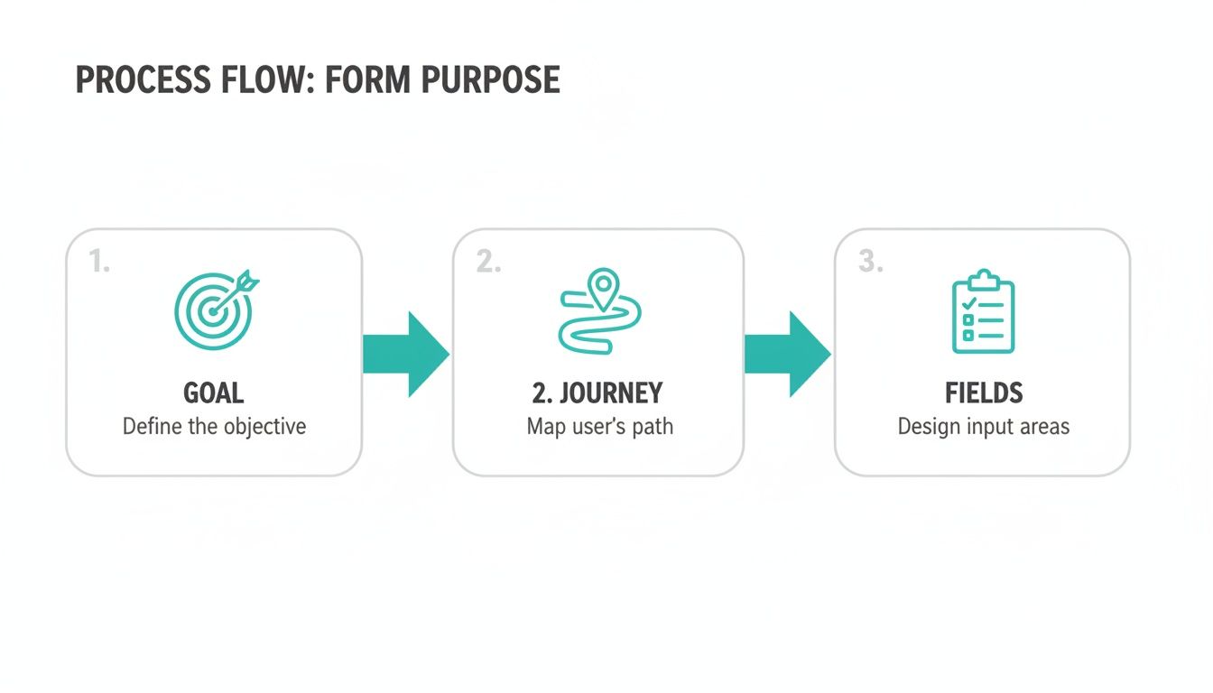
This simple process ensures every part of your form has a purpose, which is the bedrock of a fantastic user experience.
Reducing Cognitive Load with Progressive Disclosure
One of the most effective UX tactics in my toolkit is progressive disclosure. Instead of hitting users with a wall of questions all at once, you reveal them one by one. It's the classic one-question-at-a-time approach.
The psychological impact here is huge. It makes the task feel way less intimidating and much more manageable, which is a game-changer on mobile where screen real estate is precious. Each question answered is a small win, encouraging the user to take the next step.
Just picture a traditional form with ten fields staring back at you. You immediately do a mental calculation of the effort involved and might just bounce. Breaking it down keeps the user focused on the present moment, not the mountain they have to climb. If you're looking to implement these kinds of advanced interactions, exploring platforms with robust form features can give you the tools you need.
Provide Real-Time Feedback and Guidance
We've all been there: you fill out a long form, hit submit, and get an angry red error message telling you to go back and fix something. It's incredibly frustrating. This is exactly why inline validation is a non-negotiable feature. It checks the user’s input as they type, giving instant feedback on each field.
For instance, if someone types an email without an "@" symbol, a gentle message pops up immediately, not after they've already tried to submit. This simple, proactive check prevents a ton of frustration and dramatically lowers abandonment rates.
Here are a few ways to make your feedback genuinely helpful:
- Friendly Error Messages: Ditch the robotic "Invalid Input." Be specific and human: "Oops! That doesn't look like a valid email address."
- Success Indicators: A little green checkmark or a subtle highlight around a correctly filled field goes a long way in building user confidence.
- Progress Bars: For any form with multiple steps, a progress bar is essential. It tells users where they are and how close they are to the finish line, which is a powerful motivator.
Your form should feel like an intelligent assistant, not a rigid barrier. It should anticipate what the user needs and offer guidance before they even have to ask. This builds trust and makes the whole interaction feel less like a test and more like a partnership.
Designing for a Mobile-First Reality

Let’s get one thing straight: if your contact form wasn't built for a phone first, it’s already failing you. That’s not an overstatement. It's just the reality of how people browse the web today. We've long passed the point where designing for mobile was an afterthought.
Think about it. A traditional form with its neat columns, tiny input fields, and hover-state effects is fundamentally broken on a small screen. Nobody wants to pinch and zoom just to fill out their name. They'll just leave.
The numbers don't lie. With over 55% of global web traffic now coming from mobile devices, those old-school forms are a conversion killer. It’s not uncommon to see mobile form completion rates plummet to a dismal 9%. Even something as simple as adding a required phone number field can tank your conversions by 5%. The friction is just too high.
Ditch the Form, Start a Conversation
So, what's the fix? Instead of cramming a desktop experience into a mobile frame, lean into an interface that everyone already uses dozens of times a day: a messaging app. This is exactly where a conversational approach shines.
Asking one simple question at a time in a chat-like format just feels right on a phone. It's light, it's easy, and it lowers the mental effort required. The process stops feeling like a chore and starts feeling like a quick, guided text exchange.
On mobile, clarity and simplicity win every time. Your goal should be to make submitting the form feel as easy as sending a quick text message to a friend.
This conversational method tackles the biggest mobile form problems head-on. It drastically reduces typing, gets rid of the visual clutter, and gently guides the user through the process without ever making them feel overwhelmed.
Practical Tips for Mobile Form Success
To really get your mobile form right, you have to think about the physical experience. Every single tap and swipe matters. Nailing these small details can have a huge impact on your completion rates.
Here are a few things that are absolutely non-negotiable:
- Design for Thumbs: All your buttons, fields, and interactive elements need to have large, easy-to-tap targets. A user shouldn't have to perform thumb gymnastics to hit the "Next" button.
- Use the Right Keyboard: This is a simple but powerful trick. When you ask for a phone number, make sure the numeric keypad pops up automatically. For an email, the keyboard should show the "@" symbol. It removes a tiny bit of friction that makes a big difference.
- Minimize Typing at All Costs: Can something be a dropdown? A slider? A set of pre-selected options? Do it. The less someone has to type on a cramped mobile keyboard, the less likely they are to get frustrated and bail.
When you truly adopt a mobile-first mindset, you’re not just building a better form; you’re showing respect for your user's time and context. You meet them where they are, and that's how you capture leads that would have otherwise been lost.
Building User Trust with Security and Transparency
Let's be honest: in an era of endless data breaches, people are more skeptical than ever about handing over their personal information. When you ask someone to fill out your contact form, you're not just asking for their email address—you're asking for their trust. And earning it is the only way you'll get that submission.
Think about it from their perspective. Every field you add creates a tiny bit of friction. A flicker of doubt. Why do they really need my phone number? What will they do with my data? If you don't answer these silent questions, that potential lead is gone for good.
Be Upfront About How You'll Use Their Data
Transparency is your best friend here. Don't just slap a label like "Phone Number" on a field and call it a day. Add a simple, reassuring microcopy note right underneath it.
Something like, "We'll only use this to text you a confirmation and schedule your demo," immediately puts the user at ease. It clarifies the purpose and justifies the ask. This one small tweak transforms an impersonal data grab into a respectful conversation. It shows you value their privacy and you’re not going to misuse their information.
Your form's design should actively reassure the user. Every element, from field labels to privacy links, is an opportunity to prove your business is trustworthy and that their data is safe with you.
Another non-negotiable? Make your privacy policy impossible to miss. Don't hide it in the footer where no one looks. A clear, clickable link right next to the submit button signals that you have nothing to hide and are confident in how you handle data.
Show, Don't Just Tell, That You're Secure
Visual cues are incredibly powerful for building confidence on the fly. Simple things like adding a small lock icon or a note saying "Your connection is secure" can subtly reassure visitors.
If you operate in a sensitive industry, this becomes even more critical. Highlighting your compliance isn't just a good idea; it's a major conversion factor. For example, if your business deals with protected health information, making it clear you use HIPAA compliant online forms can be the single most important trust signal for a potential patient.
Ultimately, a secure and transparent form tells users you respect them. That respect is what turns a hesitant visitor into a confident lead, building a solid foundation for a customer relationship from the very first click. It’s an investment that pays dividends in higher conversion rates and stronger brand loyalty.
Use Data to Continuously Improve Your Form
Launching your contact form isn't the finish line—it’s just the start of the race. The real magic happens when you treat your form as a living, breathing part of your website, constantly tweaking it based on real user data.
Guesswork just doesn't cut it. To truly optimize your form, you need to lean on analytics to understand exactly how people are interacting with it. This goes way beyond simply counting how many submissions you get.
Key Metrics to Track
To get a clear picture of what's working and what's not, you’ll want to keep a close eye on a few crucial metrics. These numbers are your roadmap to identifying friction points and uncovering opportunities.
- Submission Rate: This is your baseline. What percentage of people who see the form actually finish and submit it? A low rate is the first red flag that something needs fixing.
- Field Drop-off: Which specific field is causing people to give up and leave? This is often the most insightful metric, pinpointing the exact source of friction in your form.
- Completion Time: How long is it taking the average person to fill everything out? If it’s taking too long, your form is likely too complicated or confusing.
Watching these numbers helps you build a story. For instance, if you see a massive drop-off rate the moment you ask for a phone number, you can probably guess that people feel it’s too invasive. This is where testing comes into play. For a deeper look at the methodology behind this, you can learn more about effective data collection strategies in our detailed guide.
A/B testing is your secret weapon for optimization. It’s a simple, powerful way to test your ideas and let your audience's behavior show you what actually works.
You can test almost anything. Try changing your button copy from a generic "Submit" to something more compelling like "Get My Free Quote." See what happens when you remove that one non-essential field you were on the fence about. Even changing the order of the questions can have a surprising impact.
By running these controlled experiments and measuring how they affect your key metrics, you can make small, steady improvements that eventually lead to a huge lift in your conversion rates.
Common Questions About Form Design
Even with the best guide, a few questions always pop up. Let's tackle some of the most common ones we hear from teams trying to nail their contact form design.
How Many Fields Should My Contact Form Really Have?
The short answer? As few as you can possibly get away with.
Think of every single field you add as a tiny bit of friction. A little obstacle. Add too many, and your potential lead will just give up and leave. Start with the bare minimum you need to have a meaningful first conversation. For most businesses, that’s just a name and an email address.
You can always ask for more information later. The initial goal is to open the door, not to conduct a full interview.
What's the Best Way to Lay Out a Form?
Stick with a single-column layout. It's the cleanest, most intuitive path for a user to follow, especially on a phone. It creates a simple, top-to-bottom flow that’s easy to scan and complete.
When you start adding multiple columns, you break that natural rhythm. People can easily skip fields by accident, which leads to validation errors and a whole lot of frustration. Even better? A one-question-at-a-time approach, like you see in conversational forms, is fantastic for keeping users focused and reducing that feeling of being overwhelmed.
How Often Should I Be Testing My Forms?
Your contact form isn't something you can just set and forget. It's a living part of your website that needs attention.
A good rule of thumb is to check in on its performance every quarter. That said, don't wait if you see a problem. If you notice a sudden dip in submissions or if you’ve just rolled out a big website redesign, that's your cue to start A/B testing immediately. As we move through 2026, this kind of ongoing optimization is what separates the good from the great.
Ready to swap out those static, old-school forms for an experience that actually engages people? Formbot helps you build interactive, conversational forms that feel more like a friendly chat. It's a simple way to boost your completion rates and leave users with a great impression.