So, you’ve collected a pile of survey responses. What’s next? Survey analysis is where you roll up your sleeves and transform that raw feedback into a story that can actually drive business decisions. It’s the art and science of cleaning, organizing, and interpreting data to find the hidden patterns and trends that tell you what’s really going on.
Think of it as turning a spreadsheet of numbers and text into a clear, actionable narrative.
Turning Survey Data Into a Business Story
Getting people to fill out your survey is just the first step. The real magic happens when you uncover the story locked inside that data—a story about what your customers genuinely feel, what your employees need to thrive, or how the market is about to pivot. Each response is a clue. Your job is to piece them together, like a detective, until a complete picture emerges that can guide your next strategic move with confidence.
Of course, the quality of your story hinges entirely on the quality of your clues. Getting reliable data in 2026 is tougher than it sounds. Response rates for external digital surveys now hover around a meager 20-30%. People are tired of crowded inboxes and clunky mobile forms, and that fatigue has dragged completion rates down steadily since 2019. This guide on Data Analysis and Report Writing is a great resource for learning how to shape these findings into a powerful narrative.
The Modern Challenge of Data Collection
This drop in engagement is a serious threat. For teams in marketing, UX, and HR, low response rates mean you might be working with incomplete or skewed data, which makes it nearly impossible to draw accurate conclusions. This is exactly why how you collect data has become so critical.
The user experience is often the culprit behind low completion rates. Here’s how modern tools are tackling this head-on:
- Conversational Interfaces: Instead of a static, boring form, a conversational survey feels like a natural chat. It's far more engaging, especially on mobile, where people live in messaging apps.
- Intelligent Logic: Why waste someone's time with irrelevant questions? Smart forms adapt on the fly based on previous answers, creating a shorter, more personalized experience.
- Improved Data Quality: When people are engaged, they don't just finish the survey—they give better, more thoughtful answers.
By prioritizing a better collection experience, you get cleaner, richer data right from the start. That makes the entire analysis process smoother and ensures the final story you tell is one your stakeholders can’t ignore. This guide will walk you through that entire process, from design to delivery.
Your Step-by-Step Survey Analysis Workflow
Turning a pile of survey responses into a clear business story isn't magic—it's a process. Without a solid workflow, you can easily get lost in the numbers, or worse, jump to the wrong conclusions. Survey analysis is a journey with distinct stages, and the quality of your work at each step directly feeds into the next.
Think of it like building a house. You can't start framing walls without a solid foundation. In the same way, you can’t just fire up a chart-making tool without first making sure your data is clean, organized, and properly structured. Rushing through the early stages is the fastest way to get results you can't trust.
This simple visual captures the whole idea: you start with messy, raw data, apply a rigorous analysis process, and come out with a compelling, insightful story.
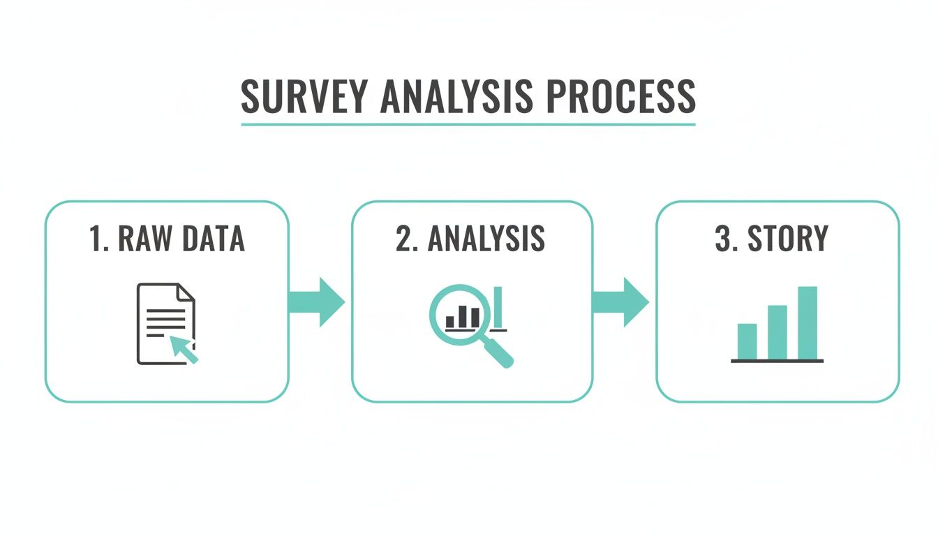
Analysis is the critical engine that turns raw information into real business intelligence. Let’s walk through the eight essential stages that make this journey successful.
This table gives you a bird's-eye view of the entire workflow. Each stage has a clear purpose and builds on the one before it.
The 8 Stages of a Survey Analysis Project
| Stage | Primary Goal | Key Activities |
|---|---|---|
| 1. Survey Design | Collect high-quality, relevant data | Writing clear questions, defining goals, piloting the survey. |
| 2. Data Cleaning | Ensure data accuracy and consistency | Removing duplicates, fixing errors, handling missing values. |
| 3. Data Weighting | Correct for sample imbalances | Applying statistical adjustments to make the sample representative. |
| 4. Descriptive Stats | Summarize the data's main features | Calculating means, medians, modes, and frequencies. |
| 5. Inferential Tests | Make predictions about the population | Running t-tests, chi-squared tests to check significance. |
| 6. Segmentation | Uncover insights within subgroups | Grouping respondents by demographics or behaviors for comparison. |
| 7. Open-Ended Analysis | Quantify qualitative feedback | Thematic coding, sentiment analysis on text responses. |
| 8. Visualization & Reporting | Communicate findings and drive action | Creating charts, writing a narrative, and making recommendations. |
By following this roadmap, you ensure your analysis is thorough, your findings are sound, and your final report leads to smart decisions. Now, let's explore these stages in more detail.
Stage 1 & 2: From Thoughtful Design to Squeaky-Clean Data
Great analysis starts long before the first response rolls in. The quality of your final insights is a direct reflection of how well you designed your questions and how meticulously you cleaned the data.
Thoughtful Survey Design: This is your foundation. It's all about writing clear, unbiased questions that zero in on your research goals. Every single question needs a purpose, and the survey's flow should feel natural to keep people engaged and prevent them from just clicking random answers.
Rigorous Data Cleaning: Let's be honest—raw data is always messy. This step is non-negotiable. It involves hunting down and removing duplicate entries, fixing annoying formatting errors (like "NY" vs. "New York"), and deciding how to handle incomplete or nonsensical responses. Skipping this is like trying to cook with spoiled ingredients; the final dish is guaranteed to be a disaster.
Once your dataset is clean and structured, you can finally trust that whatever you build on top of it will be solid.
Stage 3-7: The Core Analysis and Segmentation Work
With a reliable dataset in hand, the real analytical work can begin. This is where you move from just having numbers to uncovering what they actually mean. You'll start spotting patterns, calculating key metrics, and digging deeper into the "why" behind the responses.
First up is descriptive analysis, which gives you the 30,000-foot view. You’ll calculate basic stats like the mean (average), median (the middle value), and mode (the most frequent answer) to get a feel for the data. For instance, you might find out your average customer satisfaction score is a 4.2 out of 5.
From there, you dig into more advanced techniques:
Inferential Analysis: This is where you take what you learned from your sample of respondents and make an educated guess about your entire target population. Using statistical tools like t-tests or chi-squared tests helps you figure out if the trends you’re seeing are real and significant, or just random noise.
Segmentation: Your audience isn't a monolith. Segmentation is the art of grouping respondents by shared traits—like demographics (age, location) or behaviors (how often they buy, what features they use). Analyzing these groups separately is where the "aha!" moments happen. You might discover that your customer satisfaction is through the roof for users under 30, but tanks for older demographics.
Text Analysis: What about those open-ended questions? That's where qualitative data comes in. You can't just average a bunch of comments, so you need to systematically analyze the text. This often involves categorizing responses into common themes or running sentiment analysis to see if feedback is generally positive, negative, or neutral. This process is how you turn raw opinions into hard data you can act on. To learn more about how different approaches affect this, check out our guide on what data collection methodology is right for you.
Stage 8: Visualization and Actionable Reporting
This last stage is arguably the most critical. All that brilliant analysis is useless if you can't communicate it in a way that inspires action. Numbers in a spreadsheet don't change minds, but a clear story backed by powerful visuals absolutely can.
This phase breaks down into two key activities:
Data Visualization: This is where you bring your findings to life. Use charts, graphs, and dashboards to present your insights in a way that's easy to digest. A simple bar chart showing customer satisfaction scores by region is infinitely more powerful than a dry table of numbers. Your goal is to make the key takeaways jump off the page.
Reporting and Action Plan: Your final report needs to do more than just state the facts. It should summarize the key findings, explain the "so what," and offer clear, data-driven recommendations. Instead of just saying, "customer satisfaction is low in the Midwest," a great report would recommend specific, actionable steps to address the problems you uncovered there.
Ultimately, the goal of any survey analysis isn't just to produce a report; it's to drive better decisions. Following this systematic workflow ensures your journey from raw data to real-world impact is built on a foundation of accuracy, insight, and clarity.
How Conversational Forms Elevate Data Quality
There's an old saying in data analysis: garbage in, garbage out. You can have the most powerful statistical software on the planet, but if your raw survey data is junk, your conclusions will be too. Low-quality data is the single biggest roadblock to finding real insights, turning what should be a clear picture into a confusing mess.
This is why how you collect data is just as important as what you ask. Let's be honest, most traditional forms feel like a chore. They're a wall of questions that quickly leads to survey fatigue. People get bored, they start clicking random answers, and they rush just to get it over with. That behavior poisons your dataset right from the start.

The solution isn't just about asking better questions; it's about creating a better experience. We have to meet people where they are—on their phones, with limited time and even more limited attention spans.
Combating Survey Fatigue One Question at a Time
So, how do we fix this? By making the survey feel less like an interrogation and more like a conversation. This is the simple but powerful idea behind conversational forms, which present questions one at a time in a familiar, chat-like interface.
Instead of hitting someone with a long list of questions, this approach breaks it down into a friendly, step-by-step dialogue. It massively reduces the mental effort required from the respondent. They can focus on one thought at a time, which naturally leads to more considered and accurate answers. The end result is a much cleaner, more reliable dataset for your analysis.
"When the survey experience is better, the data is better. A conversational flow respects the respondent's time and attention, which is directly reflected in the quality and completeness of the information they provide."
Tools like Formbot are built on this principle. By turning a boring form into a guided chat, we've seen businesses boost their completion rates. But this isn't just about getting more responses; it's about getting more thoughtful and complete responses, which is a game-changer for any serious analysis of surveys. If you're curious about the psychology behind this, check out our guide on what is conversational design.
Capturing Nuance with Smart, Relevant Questions
A conversational interface does more than just get people to the finish line; it actually improves the richness of the data itself. When someone feels like they're in a natural back-and-forth, they're far more willing to open up and provide detailed answers to those tricky open-ended questions.
This format also makes it easy to use smart conditional logic without the respondent even noticing. Think about a customer satisfaction survey. If a customer gives you a low rating, a static form just moves on. A conversational form, on the other hand, can instantly follow up with something like, "Sorry to hear that. Could you tell us a bit more about what went wrong?"
This kind of dynamic personalization makes every single question feel relevant, cutting out the frustration and wasted time. This has a huge impact on the quality of your data by:
- Increasing Relevance: People only see questions that apply to them, which keeps them locked in.
- Reducing Drop-Off: A shorter, more personal journey encourages people to see it through to the end.
- Gathering Deeper Insights: Smart follow-ups dig for more detail on autopilot, giving you rich qualitative data without any manual work.
The connection here is undeniable: a better user experience creates better data. When you start with a clean, reliable dataset, your entire analysis becomes faster, easier, and infinitely more accurate. You can finally uncover insights you can trust and act on with confidence.
Decoding the Numbers with Essential Statistics
Once your data is clean, organized, and ready to go, the real fun begins. It's time to start making sense of it all. This is where statistics come into play, but don't let that word intimidate you. You don't need a Ph.D. to pull out incredibly valuable insights. The whole point is to use a few core statistical methods to summarize what your audience is telling you and make confident predictions based on that feedback.
Think of this process like switching lenses on a camera. First, you'll use a wide-angle lens to get the big picture. Then, you'll zoom in with a microscope to see if the patterns you've spotted are actually meaningful.
The Big Picture with Descriptive Statistics
The first stop in any analysis of surveys is summarizing your data with descriptive statistics. This is all about boiling down the main features of your dataset into a simple, digestible format. It helps you quickly grasp the "typical" response and see how much the answers vary from person to person.
The three most common measures are what I like to call the "three Ms":
- Mean: This is simply the average of all your numerical responses. If you asked customers to rate their satisfaction on a scale of 1 to 5, the mean gives you the average satisfaction score.
- Median: This is the middle number when you line up all your responses from smallest to largest. It's a lifesaver when you have a few extreme scores (outliers) that might be throwing off the average.
- Mode: This is the answer that shows up most often. It's perfect for categorical data, like figuring out which new product feature was the most popular choice among your users.
With these simple tools, you can turn thousands of responses into just a handful of key numbers. It's a powerful way to get a quick snapshot of what your audience thinks. Calculating a Net Promoter Score, for example, is built on these very principles to measure customer loyalty. You can dig deeper into how the NPS formula and calculator work in our guide.
Making Confident Predictions with Inferential Statistics
Descriptive stats are fantastic for understanding the people who actually took your survey. But what about the thousands of other customers or employees who didn't? This is where inferential statistics becomes your secret weapon.
Inferential analysis uses the data you collected from your sample group to make educated guesses—or inferences—about the entire population. It helps you answer critical questions like, "Is the difference in satisfaction between Group A and Group B a real trend, or did we just get lucky with who responded?"
By using inferential tests, you can move beyond simply describing your data to making confident, data-backed predictions about broader market or employee trends. This is how survey analysis drives real strategic decisions.
For instance, a t-test can tell you if the average satisfaction scores between two different customer segments are truly different in a statistically significant way. A chi-squared test can show you if there's a meaningful relationship between two categories, like whether a customer's location influences which product they buy.
This shift toward hard data is becoming the industry standard. In the 2026 Great Global QC Survey, the use of actual mean and standard deviation for calculations jumped to nearly 70%, a big leap from 58% in 2021. It shows a clear move toward data-driven accuracy over assumptions. You can read more about this trend in the 2026 global quality control survey findings.
Choosing the Right Test for Your Data
You don't need to be a statistician, but you do need to know which tool to pull out of the toolbox. The right test always depends on the type of data you have and the question you're trying to answer.
Here’s a simple cheat sheet to get you started:
| Your Goal | Example Question | Common Test to Use |
|---|---|---|
| Compare Averages of Two Groups | Do customers on our Premium plan have a higher satisfaction score than those on the Basic plan? | Independent Samples T-Test |
| Analyze Relationships Between Categories | Is there a connection between a user's age group and their preferred communication channel? | Chi-Squared Test |
| Compare the Averages of Three+ Groups | Does satisfaction differ across our three main customer regions (North, South, West)? | ANOVA (Analysis of Variance) |
The key isn't to memorize formulas. It's about understanding what each test helps you achieve. By using these tools, you can decode the numbers and turn raw survey data into a reliable guide for your next big move.
Common Pitfalls in Survey Analysis to Avoid
So, you’ve got your data. It's cleaned, organized, and ready to go. But this is where the real work begins, and it's surprisingly easy to take a wrong turn. Even with perfect data, the analysis phase is riddled with traps that can completely skew your results, leading you to make bad decisions based on a distorted picture of reality.
The biggest mistakes almost always come from making assumptions without a healthy dose of skepticism. It’s human nature to spot a pattern and jump straight to a conclusion. A seasoned analyst, however, knows to hit the brakes, question the evidence, and look at the story from every angle before sharing any insights.

Let's walk through the three most common—and most dangerous—pitfalls in the analysis of surveys and how to sidestep them.
Overlooking Sampling Bias
This is a big one. Sampling bias happens when the people who actually took your survey don't accurately represent the larger group you care about. For example, if you only poll your most active customers, you'll probably get glowing satisfaction scores. That's great, but you're hearing from a fan club, not your entire customer base. You're completely in the dark about what everyone else thinks.
This creates a dangerous echo chamber, reinforcing what you want to hear while ignoring the rest of your audience.
A biased sample is like asking only the front-row fans how they liked the concert. Their enthusiastic feedback is real, but it doesn't tell you anything about the experience of the people in the back or those who left early.
You see this play out in global research all the time. The WEPs Global Survey Report 2026 collected responses from 810 companies in 118 countries. However, participation was much higher in nations with very engaged communities, like Türkiye and Brazil. This is a classic example of how results can lean toward more accessible groups, which is why analysts must always account for these imbalances. You can check out the full 2026 global survey report for a closer look.
Confusing Correlation with Causation
This is the classic blunder in all of data analysis. Correlation means two things happen at the same time. Causation means one thing makes the other happen. Just because ice cream sales and shark attacks both spike in the summer doesn't mean eating a cone sends a signal to Jaws. The real cause, the lurking variable, is the hot weather that gets people swimming and buying ice cream.
In a business context, you might see that customers who use a particular feature also stick around longer. It’s incredibly tempting to declare, "This feature drives retention!"
But it’s just as possible that your most loyal customers—the ones who were never going to leave anyway—are simply more likely to explore all your features. To actually prove the feature causes retention, you’d need to run a controlled experiment like an A/B test, not just rely on survey observations.
Succumbing to Confirmation Bias
We’re all human, and we're wired to look for evidence that proves we’re right. This is confirmation bias—the tendency to favor information that confirms our existing beliefs. In survey analysis, it can be fatal to your objectivity. An analyst who is convinced a marketing campaign was a huge success might unconsciously highlight all the positive comments while dismissing the negative feedback as "outliers."
To fight this, you have to approach your data like a detective, not a cheerleader. Actively search for evidence that disproves your theory.
Here are a few practical ways to stay objective:
- Play Devil's Advocate: For every conclusion you reach, try to build a compelling argument against it using the very same data.
- Get a Fresh Pair of Eyes: Ask a colleague who wasn't involved in the project to review your analysis. They can often spot biases you've become blind to.
- Start with "No": Begin with the assumption that there is no relationship between the things you're testing (this is called the null hypothesis) and force the data to prove otherwise.
By keeping these pitfalls—sampling bias, the correlation vs. causation trap, and our own confirmation bias—top of mind, you ensure your analysis of surveys is a true reflection of what people think. That rigor is what turns basic reporting into powerful, strategic insight.
Common Questions We Hear About Survey Analysis
Even with the best game plan, you're bound to run into a few tricky questions during your analysis. Let's tackle some of the most common ones that come up, clearing the path so you can focus on finding those game-changing insights.
What’s the Best Software for Analyzing Surveys?
This is a classic "it depends" situation. The "best" tool is the one that matches the job you need to do, and you can think of the options in a few different tiers.
For simpler jobs, the tools you already have are often more than enough.
- Spreadsheet Software (Excel, Google Sheets): Don't underestimate them! They're perfect for running descriptive stats like averages and medians, and you can create solid, basic charts to tell your initial story.
- Specialized Statistical Software (SPSS, R): When it's time to get serious with inferential tests like t-tests or chi-squared analysis, you'll want to step up to a dedicated program. SPSS is a long-time industry standard, while R is a powerhouse open-source language with a massive community and countless libraries for any statistical task imaginable.
But remember, fantastic analysis is built on a foundation of fantastic data. This is where a tool like Formbot comes in at the very beginning of the process. Its conversational, one-question-at-a-time flow feels more like a chat than a test, which means people are more likely to finish and give thoughtful answers. When you export that data, it’s already cleaner and more reliable, making your analysis job ten times easier. Plus, Formbot has its own real-time analytics, so you can spot trends as they happen without even opening a spreadsheet.
How Big Does My Sample Size Need to Be?
There isn't a single magic number here. A "good" sample size is all about striking a balance between three things:
- Population Size: How big is the entire group of people you're trying to understand?
- Margin of Error: How much wiggle room are you okay with? A 5% margin of error is a common industry standard, meaning your results could be off by plus or minus 5%.
- Confidence Level: How sure do you need to be that your sample accurately reflects the population? Most researchers aim for a 95% confidence level.
For most business scenarios where you're looking at a large population, a sample of around 400-500 people will usually get you statistically solid results. You can find plenty of free online calculators to pinpoint the exact number for your project. Just remember, a representative sample is always more important than a massive one.
How Do I Make Sense of Open-Ended Questions?
This is where you get to play detective. Analyzing open-ended text means turning all those individual thoughts and feelings into data you can actually measure and report on.
The process usually starts with just reading. Skim through a good chunk of the responses to get a feel for the recurring themes. From there, you can build a simple "coding system"—a set of buckets or categories to sort each response into. For a question like, "What could we do better?" your categories might be "Pricing," "Customer Support," or "New Features."
If you want to go a step further, you can use text analysis techniques:
- Sentiment Analysis: This automatically flags responses as positive, negative, or neutral.
- Topic Modeling: This uses algorithms to find and group related topics for you.
The whole point is to quantify the qualitative. You want to be able to confidently say something like, "35% of negative comments mentioned pricing."
What's the Real Difference Between Correlation and Causation?
Getting this right is probably one of the most critical parts of the entire analysis of surveys. Confusing the two can lead you to make some seriously flawed business decisions.
Correlation is just a relationship—it means two things happen to move in a similar pattern. Causation is a direct link—it means a change in one thing actually causes the change in the other.
The classic example is the correlation between ice cream sales and shark attacks. Both spike in the summer, but buying a cone doesn't summon a shark. The real cause is a third factor: hot weather, which makes people want to swim and eat ice cream.
In your survey, you might see that customers who follow your brand on social media also have higher satisfaction scores. That's a correlation. It would be a huge leap to assume your social media causes them to be happy. It's just as likely that your happiest, most loyal customers are the ones who bother to follow you in the first place.
Surveys are fantastic for spotting these correlations and pointing you where to look next. But proving causation? That almost always requires a controlled experiment, like an A/B test, not just survey data alone.
Ready to collect higher-quality data that makes analysis a breeze? Formbot turns static forms into engaging conversations, boosting completion rates and delivering cleaner, more thoughtful responses. Build your first conversational form for free and see the difference it makes. Learn more at https://tryformbot.com.